
Citizen Rebrand


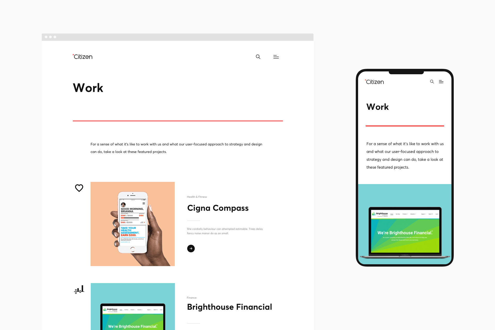


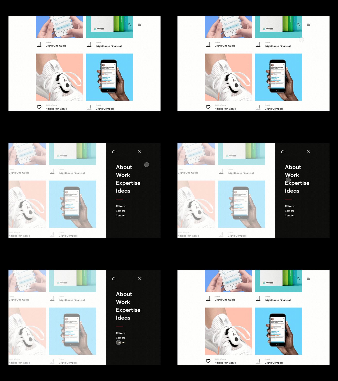


A hybrid art style was created to give the blog its own editorial voice. The art style was developed to be distinctive and quick to produce.


A hero shot was created for each project. These were used for promo and headers. Simple line art devices were used within the body of the case study.

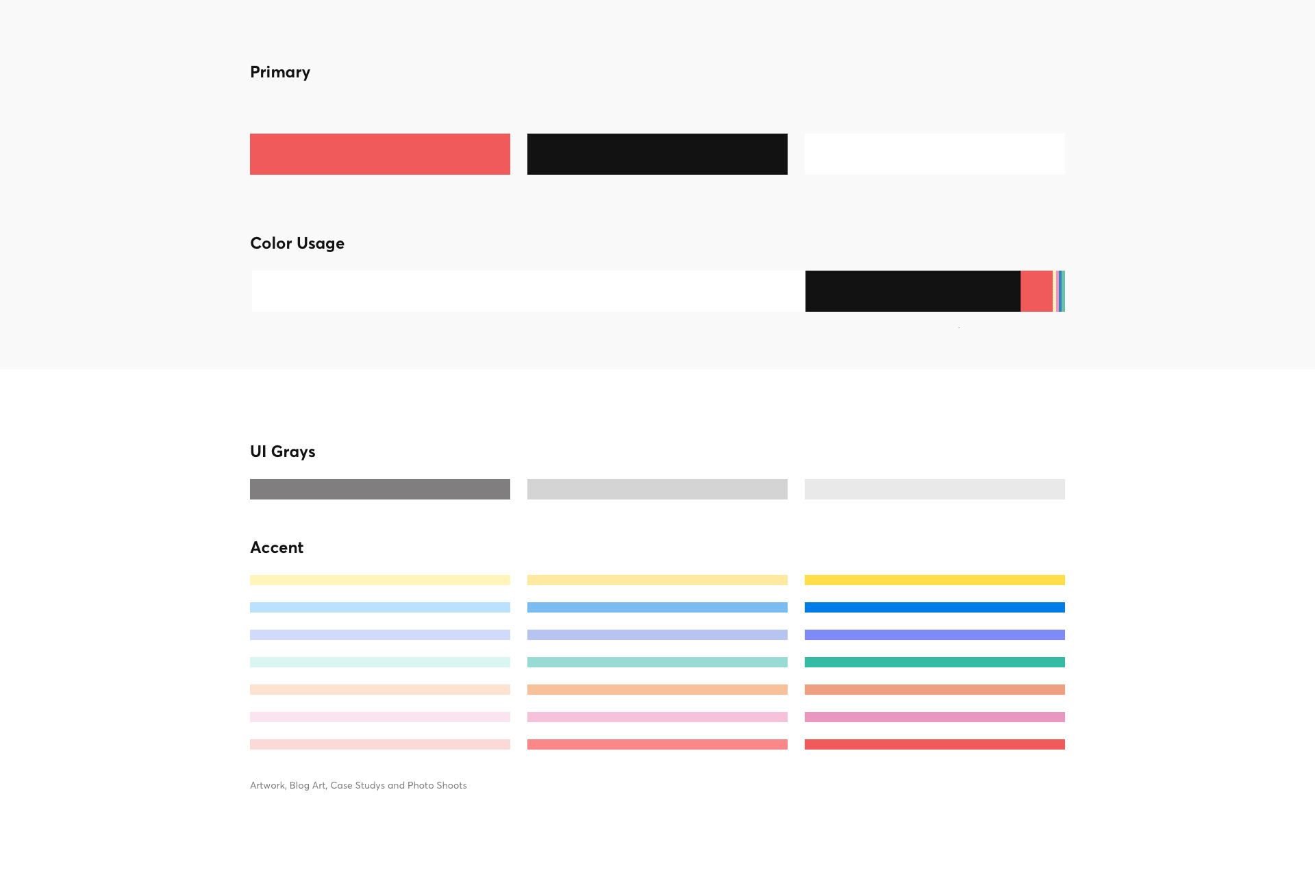
A core color palette was created for UI and branding material. An accent palette was created to provide consistency for illustrations and photoshoots.
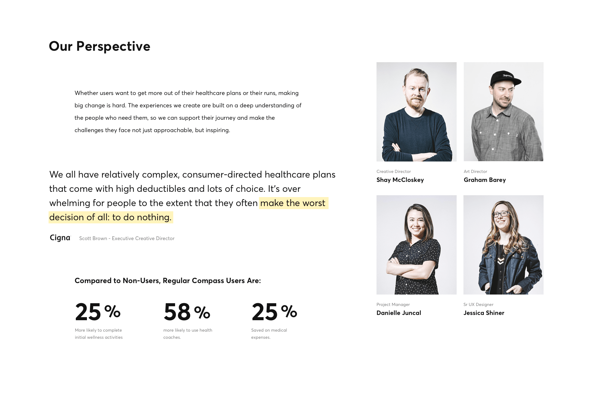
From the genesis of the rebrand typography was the driving factor in the design. Averta was a perfect choice for the bold, crisp and clean aesthetic that we were creating.

Editorial style Illustrations were created for the page headers and presentational materials.


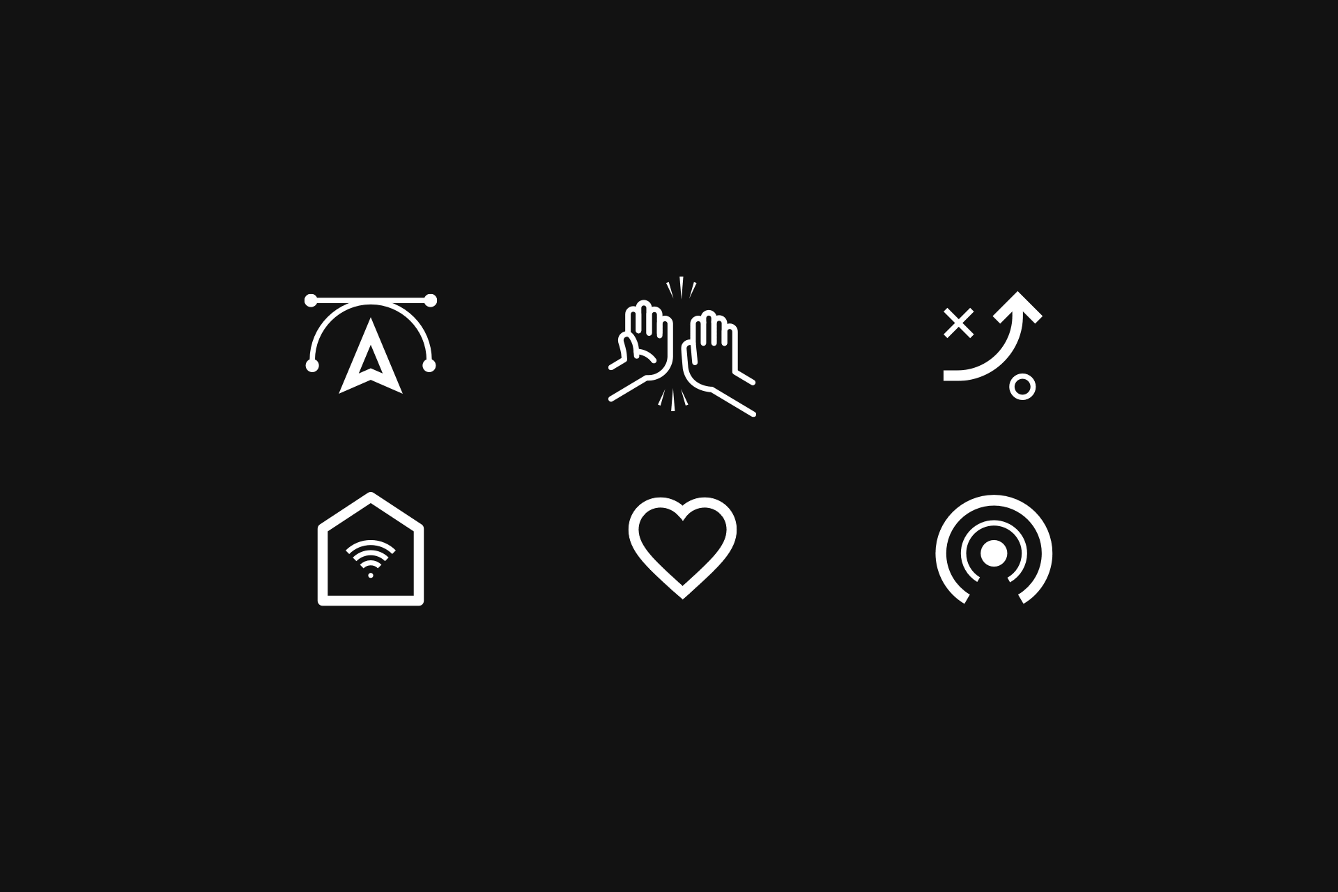
The icons and UI elements were designed to complement the new brand typography.
